
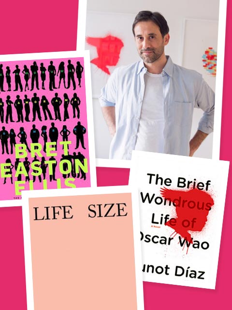
Rodrigo Corral’s created some of the most recognizable book covers in our cultural consciousness — James Frey’s A Million Little Pieces, John Green’s The Fault In Our Stars, Jeffrey Eugenides’ The Marriage Plot… But his talents go beyond the literary to include sculptures, paintings and large-scale drawings. Get to know the artist and graphic designer — who’s also the Creative Director for Farrar, Straus & Giroux and Creative Director at Large for New Directions — and discover everything from his favorite fonts to what he considers the key to good design.
The T is to Tory.
Cover I’m most proud of…
Right now I’m really loving John Green’s The Fault In Our Stars. It has taken on a life of its own. It’s spreading across sneakers, fingernails, phone cases, cakes, tattoos, but not in a corporate way. It’s all very authentic and made with love. We get to sit back and admire the power of millions of creative teens reinterpreting the design, fully making it theirs.
Favorite covers by other designers…
This changes constantly.There are so many great designers. Right now it’s Underachiever’s Diary by Benjamin Anastas, designed by Michael Ian Kaye; Glamorama by Bret Easton Ellis, designed by Chip Kidd, and The Circle by Dave Eggers, designed by Jessica Hische. Oh, and anything that’s been designed by Alvin Lustig.
First step when starting a book design…
Well, to begin, we read the book and visualize.
You messing with me? Hardcover.
Favorite font…
Sometimes a font is the cover concept and we create it out of folded paper, paint, string, blocks, anything. When that’s not the case, I like a font that does its job and doesn’t stand out or overshadow the design. I’m not sure I have a favorite.
Book that changed my life…
Hunger by Knut Hamsu, published in 1890! It came to me as I was making the decision to pursue a career in graphic arts. His story exemplifies an uncompromising drive and commitment to being a creative.
Book I like to give as a gift…
The Book of Tea, by Okakura-Kakuzo.
On my coffee table…
Matisse’s Cut Outs, John Baldessari’s Pure Beauty, Sam Falls’ Life Size and The Mushroom Collector by Jason Fulford.
The key to good design…
For me, design is a spectrum with usability on one end (function) and pure art on the other (emotion). Great usability can delight or make you feel nothing, because it’s perfectly seamless and that’s its beauty. Great art, on the other hand, evokes pure emotion. At the studio we try to deliver closer to the art side. For example, the cover of A Million Little Pieces, by James Frey, makes me feel both attracted to it and disgusted.
My favorite design project, outside of books…
We started experimenting at the studio with pulling the assets out of our design projects and letting them stand alone as iconic pieces of art (like Junot Diaz’s Oscar Wao “splatter”). I’m most proud of what this exercise has evolved into. As of late we’ve been working on unique concepts that include large-scale graphite drawings, paintings and ceramic pieces.
More to explore in Culture
-
 Culture
1.15.26
Cool Girls Who Got Fired
Culture
1.15.26
Cool Girls Who Got Fired
-
 Culture
4.21.25
Word of Mouth: ‘Can’t Look Away’
Culture
4.21.25
Word of Mouth: ‘Can’t Look Away’
-
 Culture
10.24.24
Word of Mouth: ‘Daughters’ on Netflix
Culture
10.24.24
Word of Mouth: ‘Daughters’ on Netflix
-
 Culture
10.24.24
Financial Literacy for Kids? It’s Priceless.
Culture
10.24.24
Financial Literacy for Kids? It’s Priceless.
-
 Culture
11.22.23
What’s Your Sign? Sagittarius
Culture
11.22.23
What’s Your Sign? Sagittarius